Understanding Customer Information Systems: Building a Live Train Display
Building a Real-Time Train Display: A Practical Project for Everyday Information
AITECH
4/18/20252 min read


Building a Live Train Display: Blending Practicality and Playfulness
There's something quietly captivating about train timetables — the promise of movement, the rhythm of arrivals and departures, the unexpected poetry of a platform announcement. Recently, I decided to capture a little of that magic at home by building a live train display.
The idea started simply: I wanted a small, always-on dashboard showing real-time departure and arrival information for my local stations — Meols Cop and Southport. But as with many projects, it grew into something more layered: a conversation between technology, design, and daily life.
The Build
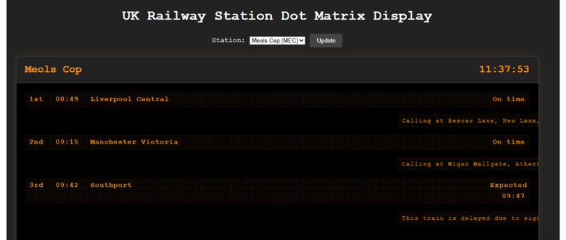
At the heart of the project is a Node.js application intended to connect to the Darwin Push Port, a service that streams live UK rail data. I’ve built the foundations — the server, the basic dashboard, and the styling — but the live data feed isn’t fully wired up yet.
For now, the display scrolls placeholder text and sample announcements, giving me a feel for the look, flow, and readability while I continue to refine the backend.
Key goals for the build:
Accuracy and Speed: Near real-time updates, without heavy page loads or complex refreshes.
Local Relevance: Focused only on my two nearest stations.
Simplicity: No clutter, just clean, readable information, suitable for a small wall-mounted display or browser tab.
In designing the display, I took inspiration from Customer Information Systems (CIS) — the familiar low-resolution boards seen on station platforms, bus stops, and subway systems.
CIS displays, also called Passenger Information Displays (PIDs), are designed to deliver clear, up-to-date information about services. They typically show arrival and departure forecasts, disruption details, and even specifics like train formation — such as the number of coaches, disabled access, and where first-class coaches are located.
Their simple, bold design is intentional: high visibility and quick readability are critical for passengers making fast decisions in busy environments. I wanted my project to echo that clarity and practicality.
Even in its early, scrolling-text form, the display feels alive — a small reminder of the constant movement beyond my front door.
Reflections
There's a certain joy in small projects like this: they’re achievable, personal, and infused with quiet meaning. I didn't just build a dashboard; I built a small window into the rhythm of my own daily world.
For me, it's another example of where calibrated ideas meet real life — where technology serves presence, not just productivity.
What's Next?
I’m already thinking about expanding the project once the live data is fully flowing:
Station Status Alerts: Quick summaries if there’s major disruption.
Get Live Data Working!: That's currently a battle.
Ham Radio Twist: Maybe even integrating the display with Home Assistant and linking it to my amateur radio dashboard.
Like the trains it displays, this project is always arriving somewhere new.
Connect
Got a question or just want to chat? I’m here to help
Explore
Inspire
© 2025. All rights reserved. Privacy, Cookies and Legal


